Being a military spouse, I felt inclined to review current websites within the U.S. Army military branch. I came across the U.S. Army Reserve website (usar.army.mil) and felt that it was drastically dated in terms of design and overall experience when compared to other military branch websites.
I asked myself, 'How would I improve this and make this a more visually appealing and engaging site experience for new recruits and current military personnel?'
In doing so, I decided to make this into a design challenge. The following sections of content will walk you through each step of my process that I took for this re-design and the final design will be shown at the end
This design challenge will only focus on the Homepage.
- Heuristic Evaluation
- Competitor Analysis
- Sketches/Wireframes
- Style Guide
- Inspiration
- High-Fidelity Mockups
- Prototype
Heuristic Evaluation
To start off this redesign, I first conducted an initial Heuristic Evaluation of the Homepage, using Nielsen Norman Group’s 10 Usability Heuristics for User Interface Design.
I decided to rate each heuristic with on a scale of Low, Medium, High Priority.
Low Priority being not urgent and minimal impact to the experience and High Priority being urgent and a size-able impact to the experience.

Competitor Analysis
Next in the process was to conduct a Competitor Analysis among other U.S. military branches.
I searched around the various branches and felt that there were 3 main websites that met the design threshold I was looking for in terms of visual design, user engagement, and accessibility.
The sites referenced were:
- U.S. Army
- U.S. Navy
- U.S. Airforce


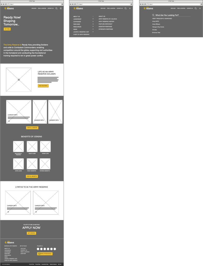
Sketches/Wireframes
The next step in the process was wireframing! I used a tool called, Balsamiq, which allowed me to pull in various elements without having to design them myself in order to shed time and piece together design iterations before coming up with this final layout.
Referencing my Heuristic Evaluation and Competitor Analysis, I initially mapped out which sections of content I wanted to display and the order in which I wanted each section to be displayed.
Some sections of content were purposefully not transferred 1:1 in this design from the initial U.S. Army Reserve website. This was based solely on my current understanding of the user base (mainly new recruits and current military soldiers) and the information most prevalent to those visiting for the first time and was deemed secondary to the main goal of the users.
Any of the information deemed secondary in nature that was not included within the visible design itself is intended to be accessible within the Mega Menu and Search.
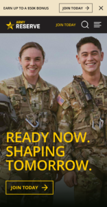
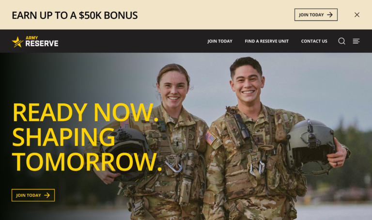
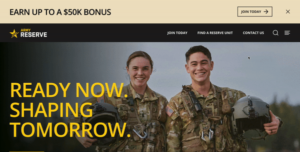
To the right, you can see the homepage redesign, along with a mega menu and search.
Style Guide
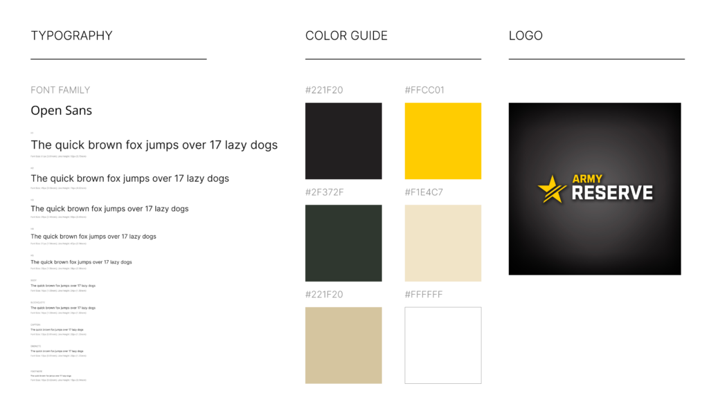
On the left, you will see the style guide built for this redesign.
I utilized the same colors from the U.S. Army’s main website.
I chose a free font called, Open Sans, that closely resembles that of the font choice used on the U.S. Army’s website as well – to maintain consistency across the branch.
I also decided to continue using the same Logo for the U.S. Army Reserve to maintain current standards.
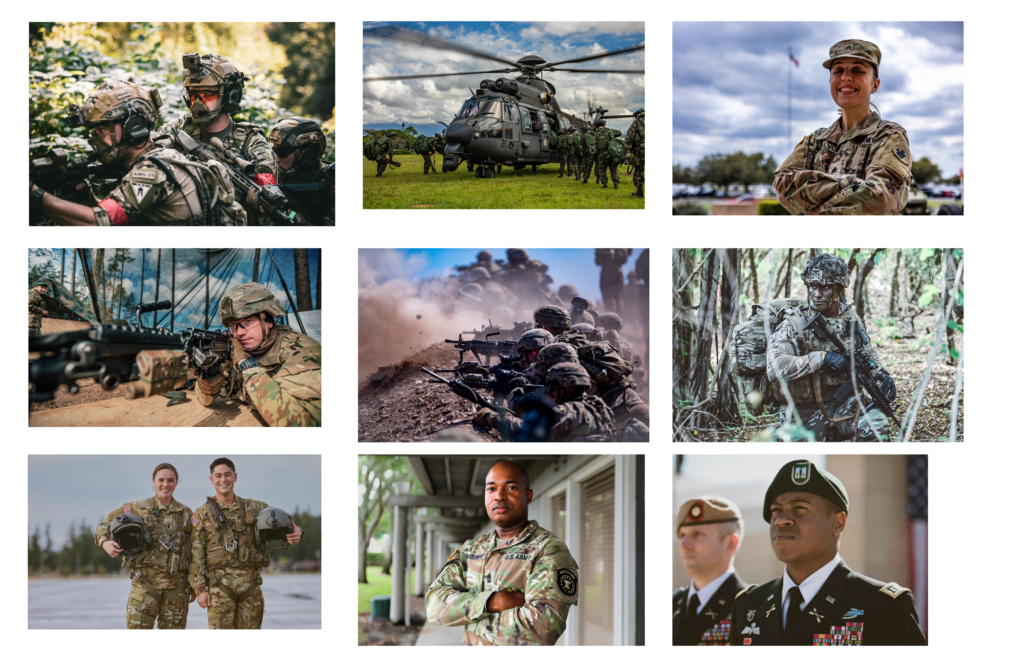
Inspiration
I took some time to find inspirational imagery to utilize within my design, referencing current U.S. Army websites and even iStock images.
These images are intended to help support the content used within the design and add visual appeal.

High-Fidelity Mockups
After collecting all of my inspirational pieces, it was time to put together the final design.
I utilized Figma for building out both Mobile & Desktop designs, taking advantage of the tools and latest features incorporated in the tool:
- Auto Layout
- Local Styles
- Library Components
- Plugins
- Prototyping (next section)
Prototype
The Final Stage of this re-design challenge was to put together prototype to simulate the experience on Desktop and Mobile devices for sharing purposes.
You’ll find links below to access the prototypes.
Result
Upon completion of this re-design challenge, this new design presents a similar look and feel to that of it’s parent, the U.S. Army (goarmy.com), to maintain consistency within the branch and allow for some unique personality and features to be showcased within the Army Reserve’s design.
This design now has a much greater visual design, with consistency in the layout and styles, along with a more engaging and interacting interface to allow potential recruits to learn more about what the U.S. Army Reserve has to offer.